The most common way to graph scientific data is with a line graph. The reason is that the line graph shows relationships between independent and dependent variables very well and most experiments are designed to determine this type of relationship.
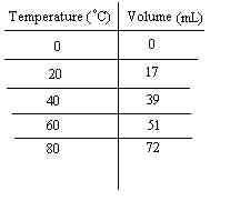
The first step in preparing a line graph is to determine which data is the independent variable and which is the dependent variable. We will use some sample data. This data was collected during an experiment to determine if changing the temperature of air in a balloon would cause a change in the airs volume. In this case the volume is the independent variable since it has been selected by the experimenter to be changed, while the volume is the dependent variable since its change (if any) will likely be determined by the independent variable. The data has been recorded in the following data table:
Once you have labeled the axes you now need to determine the scale for
each axis.