GRAPHING
Scientific Data on a Line Graph
You want to use as much of the graph as possible so that you can see
any patterns.
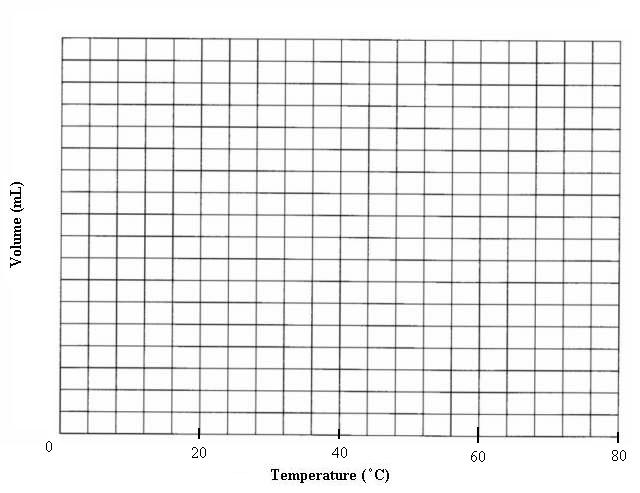
Let's do the x-axis first.
-
Count the number of lines the axis has: count like moving on a board game,
don't count the first line. On this graph there are 20 lines on the x-axis.
-
Determine the maximum value to be plotted on the x-axis. For this data
the maximum temperature was 80 oC.
-
Set up a ratio of maximum data value to number of lines:
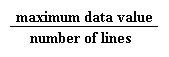 =
=  this reduces to 4 oC for every 1 line
-
You probably do not want to label every line and there is really no use.
So let's label every 4 lines, that would be 16 oC for every
4 lines. But our data for temperature is every 20 oC, so we
probably want to label every 20 oC. In order to do this you
would label every 5 lines. The idea is to label the axis quickly and conveniently
without trial and error.
-
NOTE: The data used here is designed to work out in a nice reducible fraction.
If your ratio was not reducible to whole numbers simply divide out to get
a value, maybe it was 4.4274 oC for every 1 line. Simply round
up till you find something easy to use in scaling your axis. I would choose
4.5 oC for every line here, or 9 oC for every 2 lines.
I should be able to label fairly easily with those values.
-
Back to our example. Scale the axis:
Now do the same for the y-axis.